 Hyperreality, in postmodern philosophy, is reality by proxy; the hyperreal, in art, depicts an exaggerated reality. And, to my mind, nobody exemplifies the hyper-realist style of painting better than Lucian Freud. A retrospective collection tracing his evolution as an artist and highlighting his major works is currently on display at the National Portrait Gallery in London, open through the end of May.
Unfortunately, you have to make a reservation to get in (which has also happened with the Hockney and da Vinci exhibitions) and it’s hard to get tickets: only off-hours seem available (I fit in a Thursday at 4:30). Still, it’s a wonderful set of works and well worth seeing if you plan ahead.
I really like figurative art generally, but Freud’s works in particular have always made me uncomfortable. His lush nudes, with exaggerated folds of flush and bluish skin feel provocative and unhealthy. The idea of confronting wall after wall of these paintings wasn’t really appealing. But the reality is much more nuanced and interesting.
Freud stayed within a theme of nudes and portraiture, but when you see the chronology of his works, I feel like he saw these subjects as both a calling and a challenge. He deliberately chose hard subjects: I can see him working out problems of perspective, shadow, of how to capture a person’s qualities and personality. Sometimes he succeeds, but often he solves one problem only to hit another. As a tutorial series, it’s fascinating.
 Technically, he’s very skilled. This shows up in the flawless way he paints plants and objects: naturally colored, finely detailed, sense of depth, all well handled (as with Interior with Plant, Reflection, Listening) . But when he moves into life drawing and portraiture, he seems to have to work harder.
Take Interior at Paddington, below. Again, a lovely, sunlit plant (the actual painting is about 5 feet tall). But the child has a curiously concave face that almost looks over-worked, like he tried to get the brow, the nose, the hair but, like Michael Jackson, ended up mutilating the result.
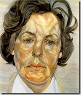
It happens, again, with shadows: consider Woman in a White Shirt. The flesh tones are true, but broken into highly contrasting patches of color patches that accentuate rather than depict the underlying bone and muscle. My art teachers always reminded me that shadows aren’t blacks and greys, they are actually complementary colors, but Freud takes the complement of pink to blue extremes. It make his subjects look hypoxic, blotchy, and clownish.
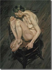
Finally, there is perspective. He loves a reclining pose, but when a limb projects towards him, as with Naked Girl Sitting on a Chair, the closer parts can get bulbous and lumpy, not a natural tilt or proportion. Here, the shadows beneath the ankle are flat and misplaced, the heel too large compared to the toes, the back foot misproportioned compared to the front.
Maybe these three qualities are all purposeful exaggerations, but as his works progress through time, they seem to disappear. I think that he works out the issues of faces, shadow, and perspective, allowing his later paintings become much more evocative and finished. The blues, viewed from a distance, bring out the details of the face, the firm vs. soft muscles, the places time has worn rough.
Man with a Blue Scarf and Naked Portrait, both painted more recently, have perfectly overcome the earlier issues to capture the reality and the vibrancy of his subjects. I also think that we tend to see these paintings from much too close, where the details become exaggerated. When I back across the gallery, the paintings simply look lifelike.
I really enjoyed the show, gaining a much better understanding of Freud’s works and a much more human perspective on the artist. If you can’t get to the Gallery show, WikiPaintings has a wonderful catalog of his works. The paintings that I’ve shown, above, are all drawn from that collection, and all are paintings that can (and should) be seen in the exhibition.


