
 The days are turning colder, –4C in Brussels last night, snow expected around Maastricht.
It’s a festive time to be out, even though it’s with hands shoved deep into pockets and chin tucked beneath a scarf . Shop owners are opting for edgier window displays this year: it certainly grabs attention even when I can’t be sure what they are selling.
My favorite is the New Year’s woman, unwrapped like a bottle of fine champagne complete with twist-tie at the back of the dress, and her weird albino-lingerie harem.


Don’t hate the PowerPointers
 In the twenty-odd years since it’s creation, PowerPoint backdrops have become every speaker’s Charlie McCarthy.
Intended to give life and structure to status updates and sales pitches, the slide deck has, instead, become a wooden accompaniment to listless recitations in meeting rooms and lecture halls. The dreadful examples filling SlideShare are enough to make me yearn for a return to acetates.
Many commentators blame the tool, but it can clearly be tamed. My B-school gave us a half-day’s training with a whiz from McKinsey who taught us to storyboard, use action-titles, and adopt balanced color and graphics. Clif Atkinson makes similar arguments in Beyond Bullet Points tutorials. The result better illustrates a talk instead of simply repeating it.

Alternatively, Saachi & Saachi recommend bold graphics and high-contrast messaging. These grab attention, but I’ve found that they require perfect timing an coordination to be effective. Also, overused, they get tiresome fast.

And they still don’t solve the fundamental problem of the the way that speakers interact with their slides.
Instead, return to Edgar Bergan’s interactions with Charlie. The interaction is a dialog, straight man vs witty rejoinder, lead-in vs. double entendre. The best speakers have a similar relationship to their background material. It doesn’t just support the story, it joins them in the narrative of telling it.
Seth Godin has few words or animations in his slides, but uses them as an ongoing commentary on his ideas. Famously, Steve Jobs uses his slides as tease and tells, foreshadowing then revealing the reality behind his spoken reflections. There’s a real rapport between the men and the medium.

Creative or gifted amateurs can sometimes do almost as well or, failing that, at least provide some entertainment in trying. Pecha Kutcha night, 20 slides, 20 seconds each, returns to Maastricht this Tuesday evening. A dozen presenters will try their luck: it’s a bit of a poetry slam in execution, but makes for a fun evening.
…and you can learn a lot about how to give a presentation watching people tell their stories, accompanied by a tight set of images.
At home with Installation Art
The Wall Street Journal magazine (European edition) is a glossy quarterly dedicated to the good life, as envisioned by corporate high-fliers. It has articles on fast cars, oversized jewelry, exotic destinations and world culture. I ended up thumbing an issue left on my seat at a recent layover, and was fascinated by an article depicting the hazards of Installation Art.
The business of creating, trading, and collecting art is complex and subtle (Sarah Thornton’s Seven Days in the Art World is a fun introduction). Much of the art that patrons take home can be hung or mounted beneath a focused spotlight, giving character and style to the surrounding space. Installation Art, though, is different: they are designed to transform space rather than to complement it.
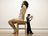
Ron Mueck’s outsized, lifelike sculptures of distorted human figures are a good example. These compositions are amazing in museums, but what would it be like to have one move in with you? They require outsized rooms for display and laborious cleaning to maintain their integrity. They dominate the space around them. It’s hard to imagine normal life in a room occupied by one: could you encourage casual dinner conversation when a naked giant hovers over the table?
The article concludes that few buyers are able (or willing) to adapt their homes and lives to the demands of these three-dimensional compositions, even questioning whether these pieces can still offer some promise of profits and respect. It’s all relative to scale, I suppose. In a small space, any work that dominates the room also defines it. In my apartment, the only thing that carries that weight is my collection of books, overflowing shelves along the facing wall. Many Dutch homes are similar: plants, pianos, and bookshelves paint a public face behind curtainless windows to tell passers-by something about the tenant.

Still, maybe it would be fun to be the only one on my street with a giant looking back out.